Vertical rhythm
Profiles that feel aligned with battens, screens, and taller facade elements help the letterbox sit naturally within contemporary exterior compositions.
Huge sale on now•Sale ends 31st October
Shop saleMinimalist letterbox design for refined exterior architecture
These designs speak to contemporary NZ architecture, with options ranging from leaner minimalist profiles to a bold black premium statement piece for darker facades and crisp entry compositions.
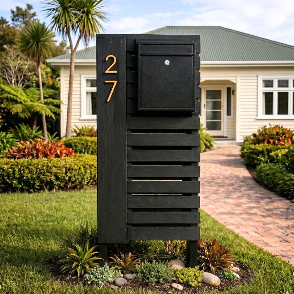
A premium black architectural pillar letterbox that gives modern homes a bold, high-end entrance feature.
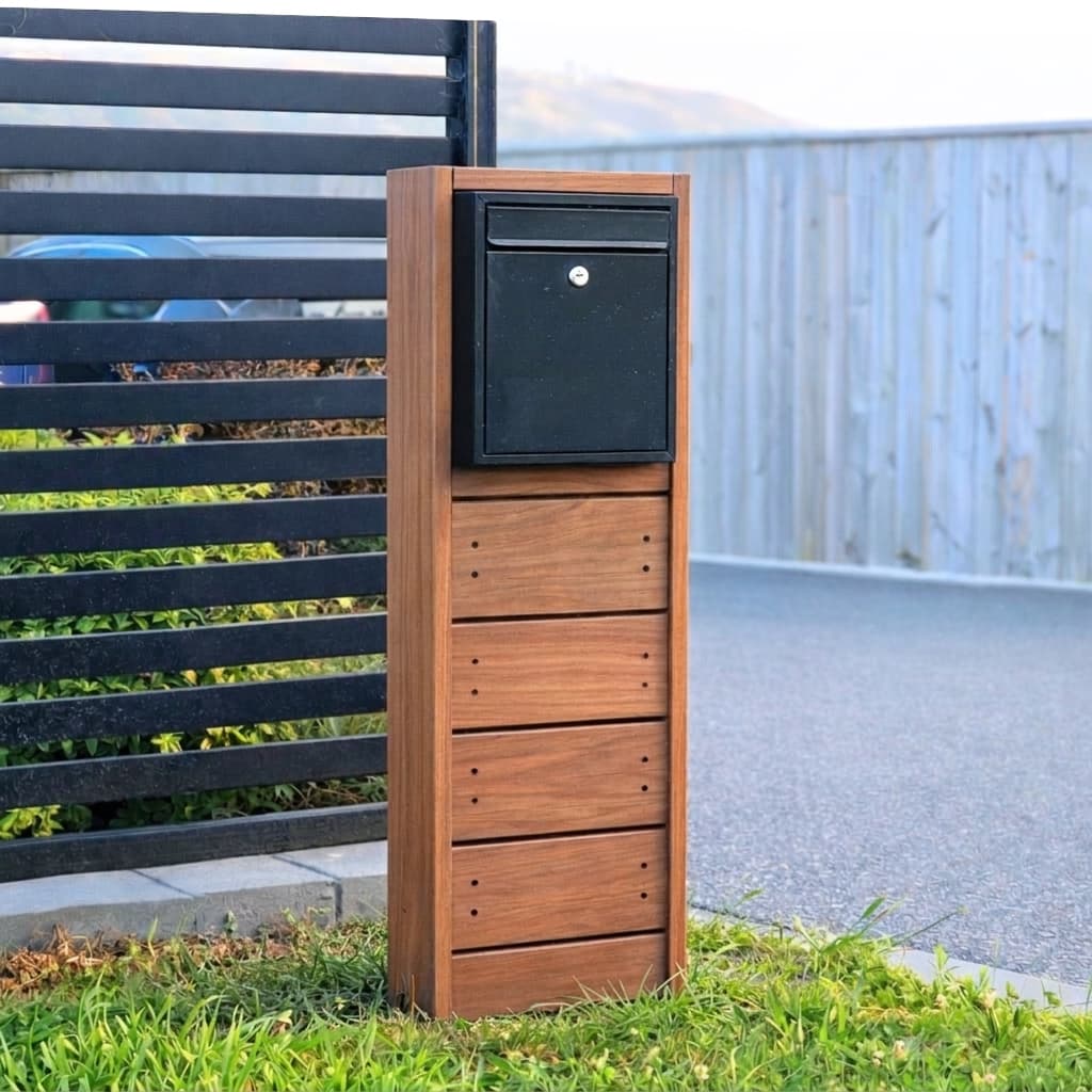
Sleek and contemporary design that complements any modern home exterior.
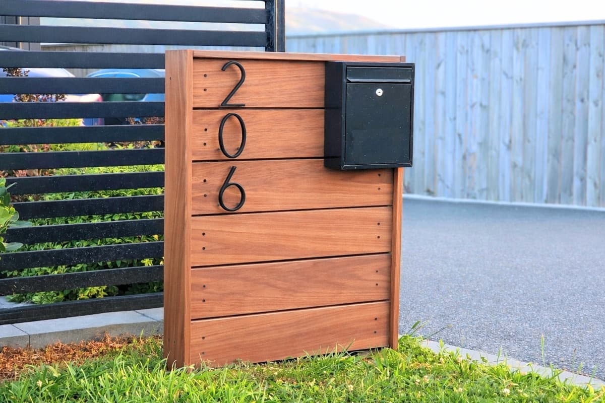
Wide and grand contemporary design that complements any modern home exterior.
Modern architectural letterboxes need to do the same job as the rest of the exterior palette: communicate restraint, proportion, and material confidence from the street. On contemporary New Zealand homes, the letterbox often sits against dark cladding, plaster, concrete, or vertical screening, which means the design has to feel deliberate rather than decorative. The best pieces read like an extension of the architecture, adding warmth and function without breaking the visual language established by the home.
That is why architectural mailboxes in NZ are often chosen for their silhouette as much as their practicality. Vertical rhythm, shadow lines, darker metal elements, and crisp edges matter. On black or charcoal homes especially, the right letterbox can introduce enough texture to stop the entrance feeling flat while still maintaining a minimalist look. Timber is particularly effective here because it softens hard exterior finishes and gives the frontage a more tailored, premium feel.
This collection is aimed at homeowners, designers, and builders searching for modern mailbox ideas that sit comfortably alongside contemporary landscaping and uncluttered entrance detailing. Instead of a generic suburban box, these designs support the type of exterior composition seen on pavilion homes, monochrome townhouses, and carefully finished architectural new builds. They can echo batten screens, complement dark joinery, and help house numbers feel integrated rather than tacked on later.
A contemporary letterbox should also work hard in everyday life. It needs to be visible enough from the street, easy to access, and durable enough for exposed NZ conditions. The difference is that it achieves those practical goals without looking utilitarian. When the proportions are right, the letterbox becomes a small but important part of the facade story, reinforcing modern curb appeal instead of diluting it.
Architectural styling usually comes from disciplined proportions and material contrast rather than flashy ornamentation.
Profiles that feel aligned with battens, screens, and taller facade elements help the letterbox sit naturally within contemporary exterior compositions.
Timber paired with darker mailbox components works especially well against black, charcoal, and deep grey homes that need texture without clutter.
Minimal visible detailing keeps the focus on clean form, shadow, and the overall entrance composition.
Think about the scale of the home, the width of the driveway approach, and how much visual weight the boundary needs from the road.
The Blackwood is ideal when the home already leans black, charcoal, or deep neutral and you want the letterbox to reinforce that premium palette. It delivers darker contrast, a stronger statement, and less install hassle thanks to its assembled format.
View The BlackwoodThe Slim Kiwi is the natural choice when the goal is a leaner profile that tracks with vertical screens, darker exterior palettes, and more restrained landscape compositions. It feels crisp, quiet, and purposefully architectural.
View The Slim KiwiWhere the entrance needs a little more substance, The Kiwi introduces extra width and presence without losing the clean architectural feel. It works well beside larger garage doors, wider paths, and fuller planting compositions.
View The KiwiContemporary NZ homes often lean into darker colour palettes and simplified detailing. A timber architectural letterbox introduces enough natural texture to stop the frontage feeling flat, while still looking disciplined and modern.
That balance is especially valuable when the rest of the facade already has strong hard surfaces such as concrete, long-run metal, or smooth plaster. The letterbox becomes a small point of warmth that still belongs to the architecture.
The problem with many off-the-shelf mailboxes is that they bring in a different design language to the rest of the home. Curves, decorative trim, or bright finishes can look disconnected beside contemporary architecture.
By contrast, a minimalist timber pillar with clean lines keeps the entry sequence coherent. It supports house-number placement, frames the driveway edge neatly, and preserves the calm, edited look that modern homes rely on.
Timber adds warmth against dark or monochrome exteriors without competing with the home itself.
The silhouettes stay clean enough for modern facades, vertical screens, and landscape-led entry compositions.
These are the kind of letterboxes homeowners choose when curb appeal matters as much as everyday practicality.
See the slimmer architectural option for minimalist entrances and darker exterior palettes.
Read practical advice on matching timber profile, placement, and upkeep to a modern NZ build.
Compare freestanding entrance-focused styles if you want stronger vertical presence at the boundary.
Get help choosing the right profile for black cladding, vertical battens, or a minimalist landscape plan.
It usually comes down to proportion, material selection, and restraint. Clean lines, minimal clutter, and a shape that feels consistent with the home's exterior are what create an architectural result.